Recite. - UX Case Study.
Written By: Thomas Kelly. Date: 18th May, 2024.
Overview.
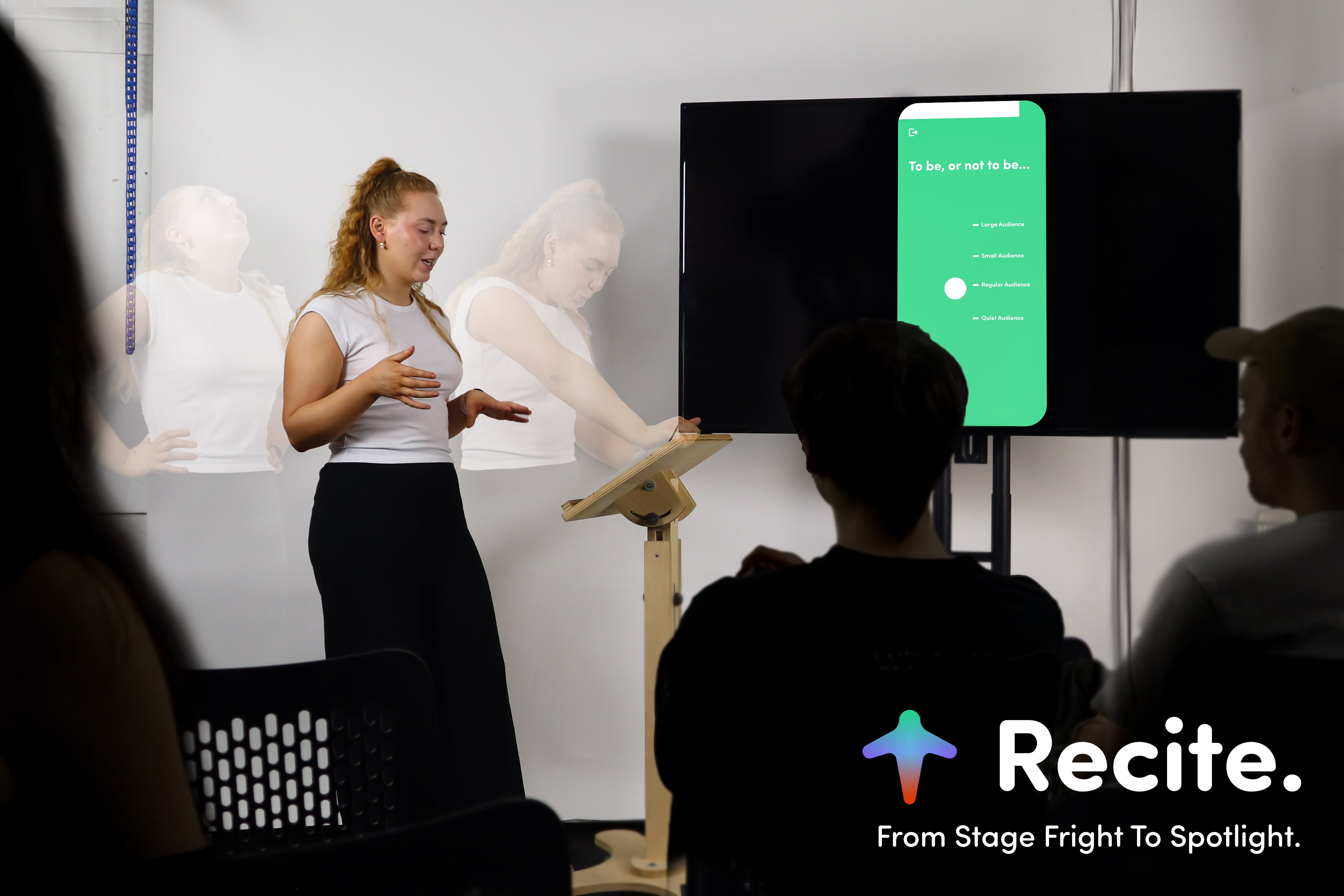
Recite is a mobile application aimed at improving self-confidence
in public speaking. The project was designed and developed by
Thomas Kelly as part of the NCAD Major Project in the Interaction
Design BA programme.
Over a span of 5 months, Recite evolved from an initial concept to
multiple iterations of interactive prototypes. The project brief
required a creative technologies approach, which guided the design
and development process.
Research.
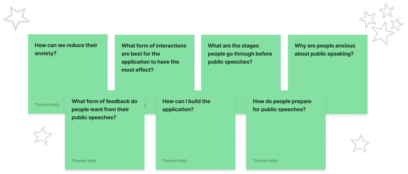
Research Questions.
For each question, defined from the outset to provide research direction, we provided a corresponding justification, clarifying the rationale behind its formulation and identifying potential sources for obtaining answers. This methodical approach ensured that each element of our research was purpose-driven and systematically aligned with relevant scholarly and industry-specific resources.
Insight.
From Literature.
Confidence is seen as a key measure of public speaking performance.
Insight.
From Interviews.
Organisations such as Toastmasters struggle to get young people through the door due to upfront cost and public speaking anxiety.
Insight.
From Survey.
Around 70% of young, developing professional classify themselves as anxious public speakers.
Insight.
From Interviews.
Repeat structure and ritual is a major reason members keep coming back to the Toastmasters club.
Insight.
From Competitor Analysis.
Young, developing professionals are overlooked by public speaking training applications and organisations due to clients being mainly B2B.
Define.
Three personas were created from the insights and observations of
problems affecting users seen during the research phase. The
personas were a student who has a physical reaction when public
speaking (shaking, sweating), a recent design graduate who has
imposter syndrome in stakeholder meetings, and a best man who is
struggling with the idea of giving a speech in front of a crowd.
From interviews and feedback from potential users, the design
methodology and process moving forward was to create enjoyable,
non-intimidating methods of improving public speaking.
Concepting.
Co-Design Workshop.
Extracted from academic literature were the features of public speaking significantly correlated with good performance. In a co-design workshop, we tasked young, developing professionals and designers to create activities that could improve some of the aforementioned features.
Ideation.
Crazy-Eights exercises were conducted with the intended user
base. They were prompted using a ‘How Might We’ statement to
frame their thinking and spark inspiration for ideas.
The Crazy-Eights ideas were gathered and sorted into possible
user flows to define and ideate a user’s direction through the
application.

Early Prototyping.
Low-Fidelity Prototypes.
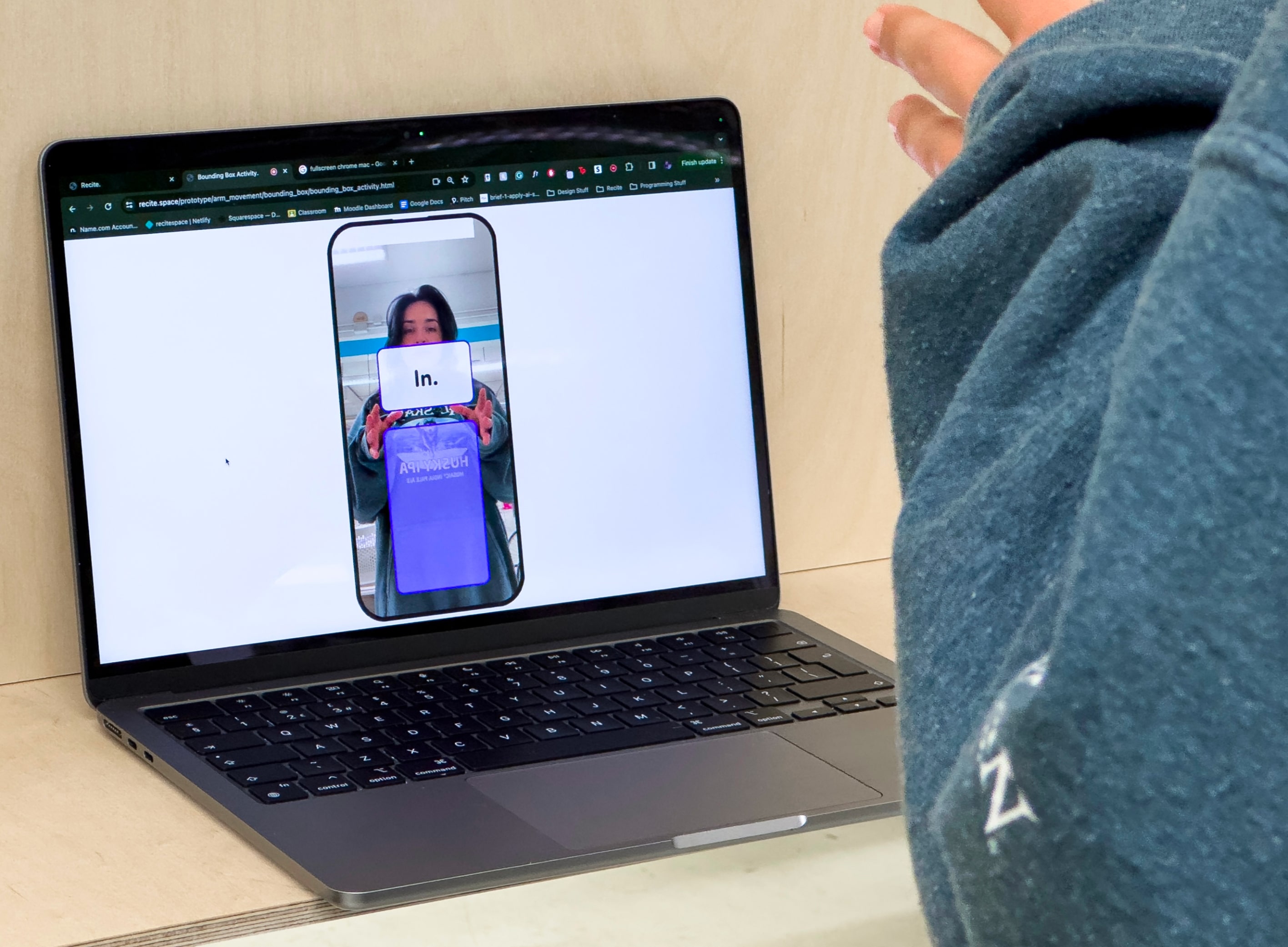
The first prototypes created were low-fidelity activities
focussing on getting users to practice different features of
public speaking. The images you can see on the right are tasking
users with moving their arms and keeping their arms up.
The activity prototypes created were decided upon from an
extensive list which was made into an impact-over-effort matrix.
Early Interactive Prototypes.
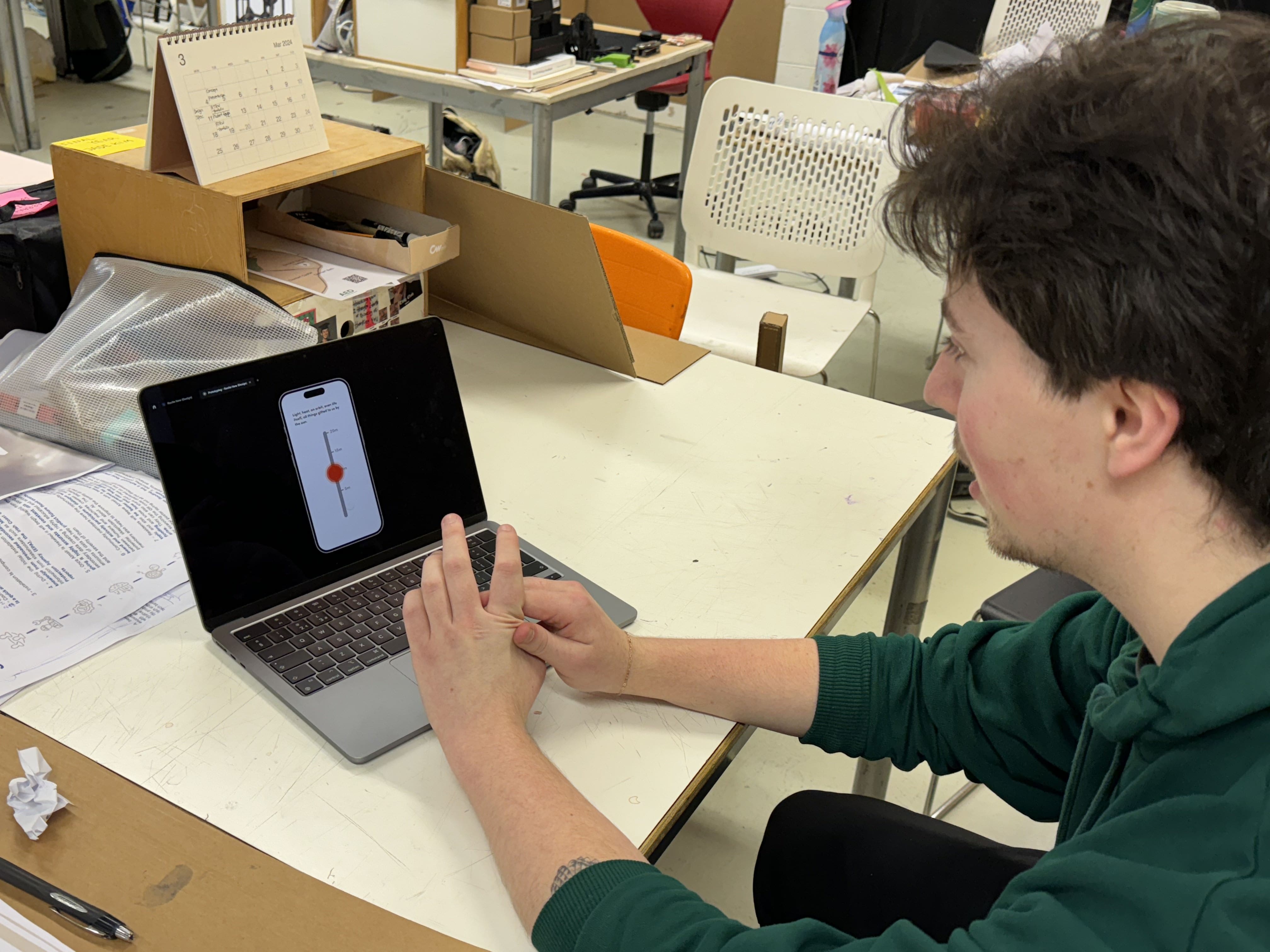
Interactive Prototypes were created on Figma or using p5.js for vocal and video media input. Highlighted during this testing was the users’ questioning of how this would improve their public speaking self-confidence in such a short window.
Interactive Prototyping Iterations.
Prototype 1.
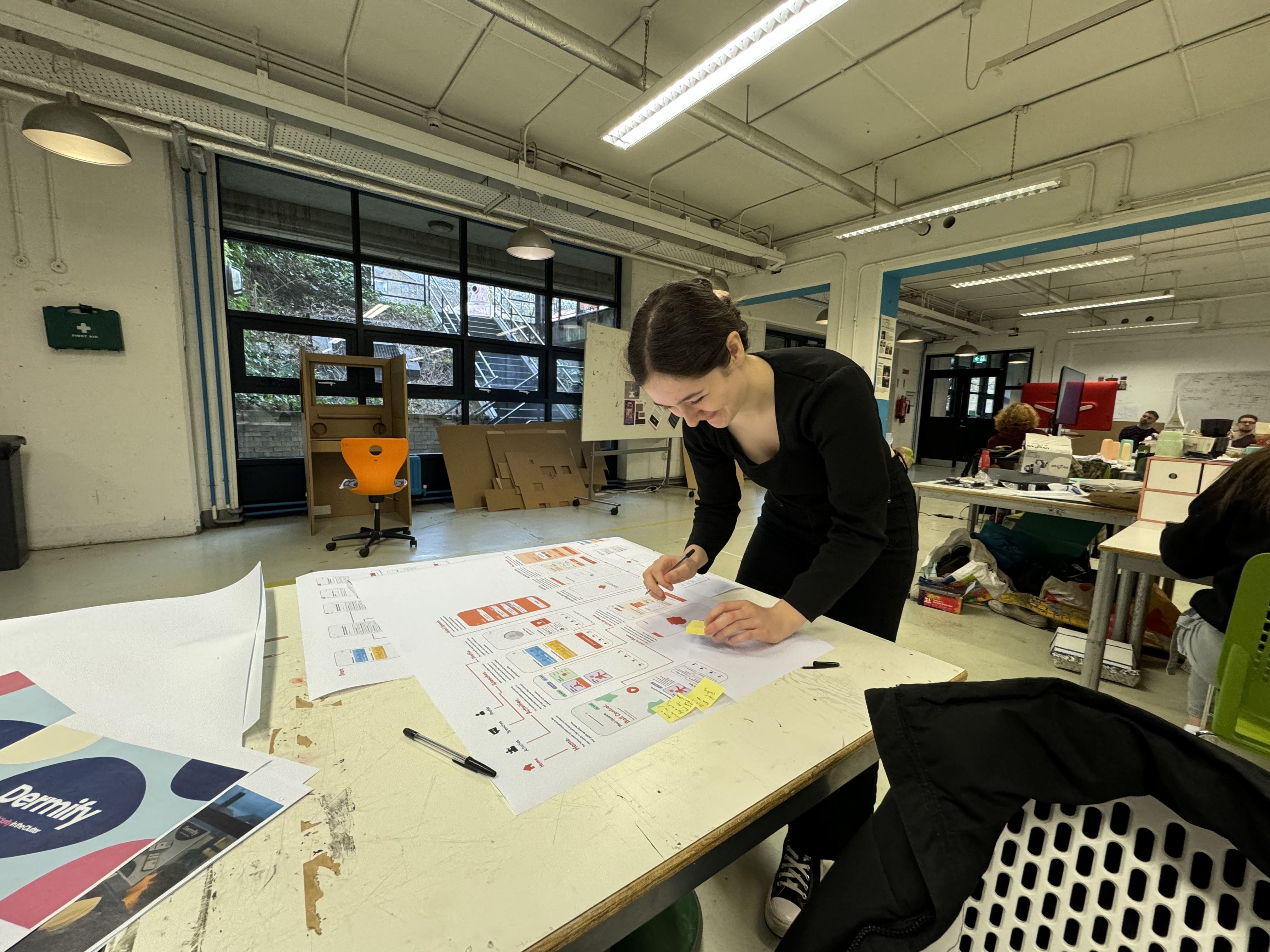
Interactive Prototype 1, consisted of the general navigation
of Recite and three playable activities focussing on arm
movement and vocal projection, these activities are seen
throughout later prototypes.
This prototype had issues with contrast and readability in
activities from a distance, meaning arm movement activities
which made use of the user’s camera hard to use.
Prototype 2.
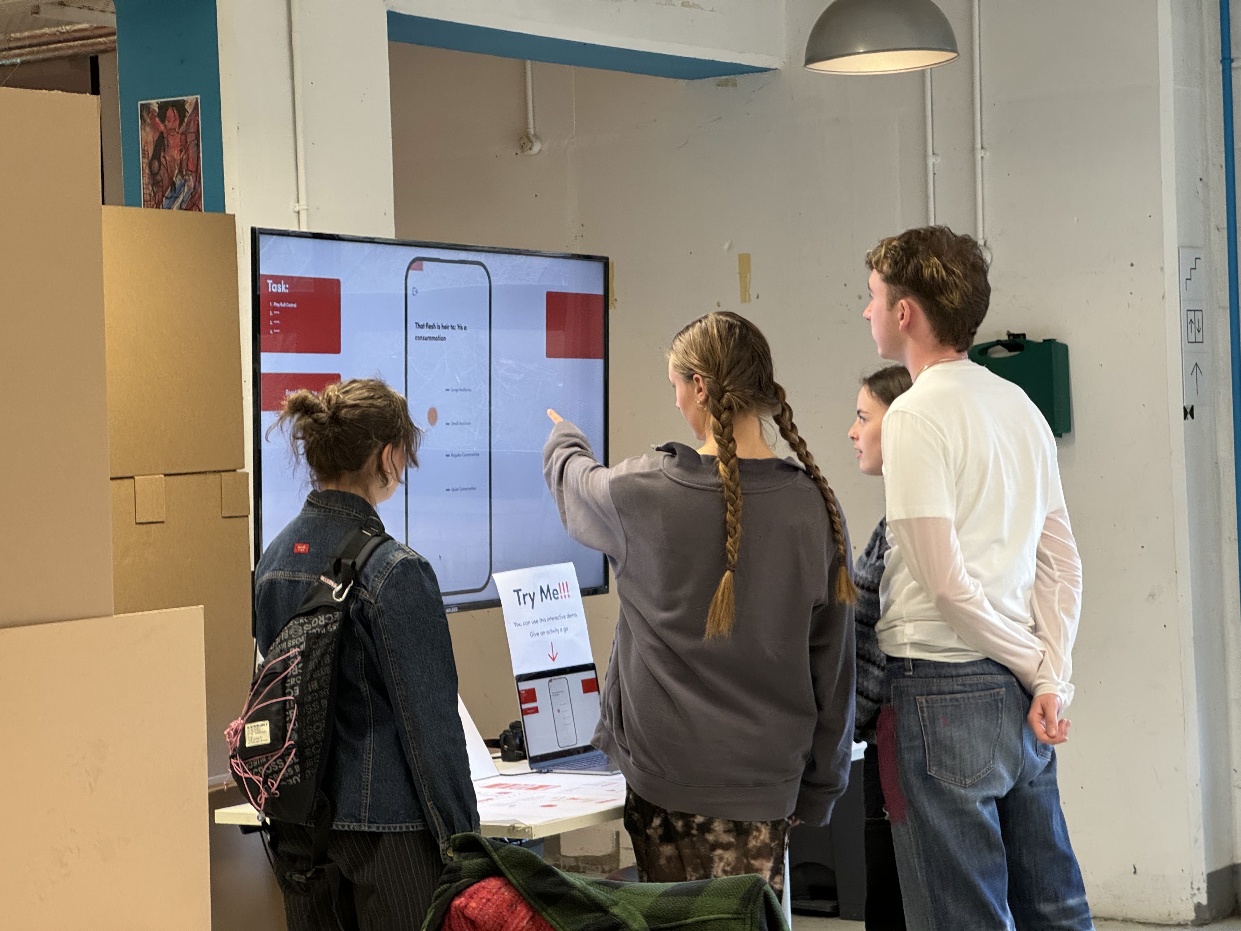
Prototype 2 was tested by young developing professionals who
afterwards gave feedback on their experience through an
informal interview format.
Previous issues with activity understandability were addressed
with the addition of explanatory tutorial videos on each
activity menu page.
A strict evaluation testing method using a control, and other
public speaking practice methods, we determined that the use
of this prototype of Recite deemed to be comparable, to
observers, to practising a speech using memory and repetition
of the speech for an equal amount of time. This was
confirmation of Recite moving in the direction of being a more
fun, enjoyable replacement to practicing public speaking with
an equal amount of impact.
Prototype 3.
With findings extracted from a SWOT analysis of EdTech previously mentioned in the research phase section, Prototype 3 used a journey approach to activities. Offering users a set of activities all working to progress a feature of their public speaking. Each activity building on the previous one to improve the user’s ability and confidence in themself over time.
A heuristic evaluation and UI feedback session was conducted on Prototype 3, users and designers gave input on screen flows of the prototype and tested its interactions. A lack of user control was found. Users felt as though they were rushed through activities. Given that reflection is important in self-improvement, this was to be addressed.
Final Prototype.
The Product.
The final prototype for Recite, up to May 18th, 2024, is a public speaking self-confidence-improving mobile application currently hosted as a web app. It brings users through path-style navigation, improving public speaking features through repetition and gradual progression.
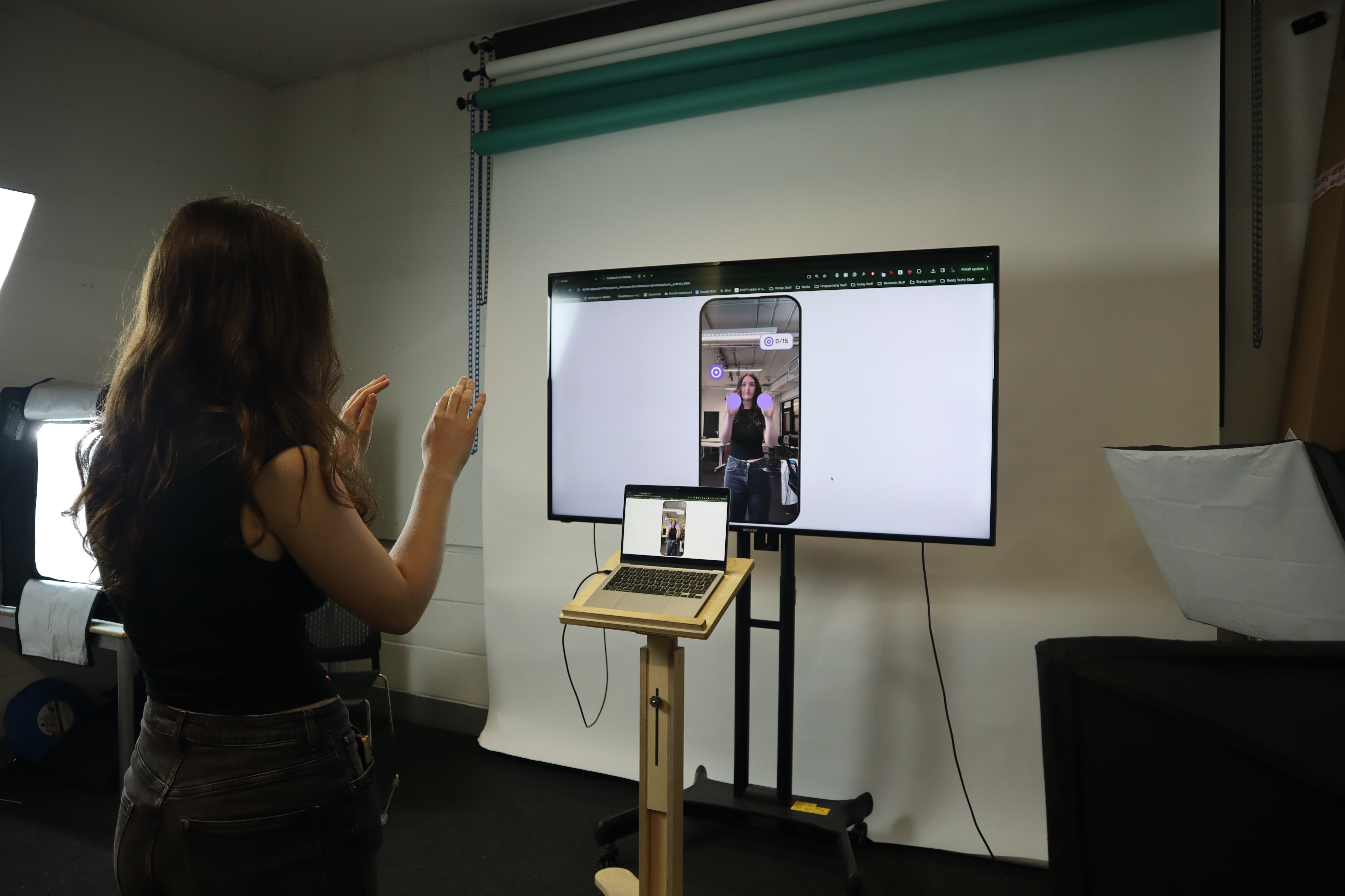
Five fully developed activities are featured. Four of these focus on arm movement, demonstrating an activity session. The remaining activity focuses on vocal projection, this activity was developed since Prototype 1.
Activity Flow.
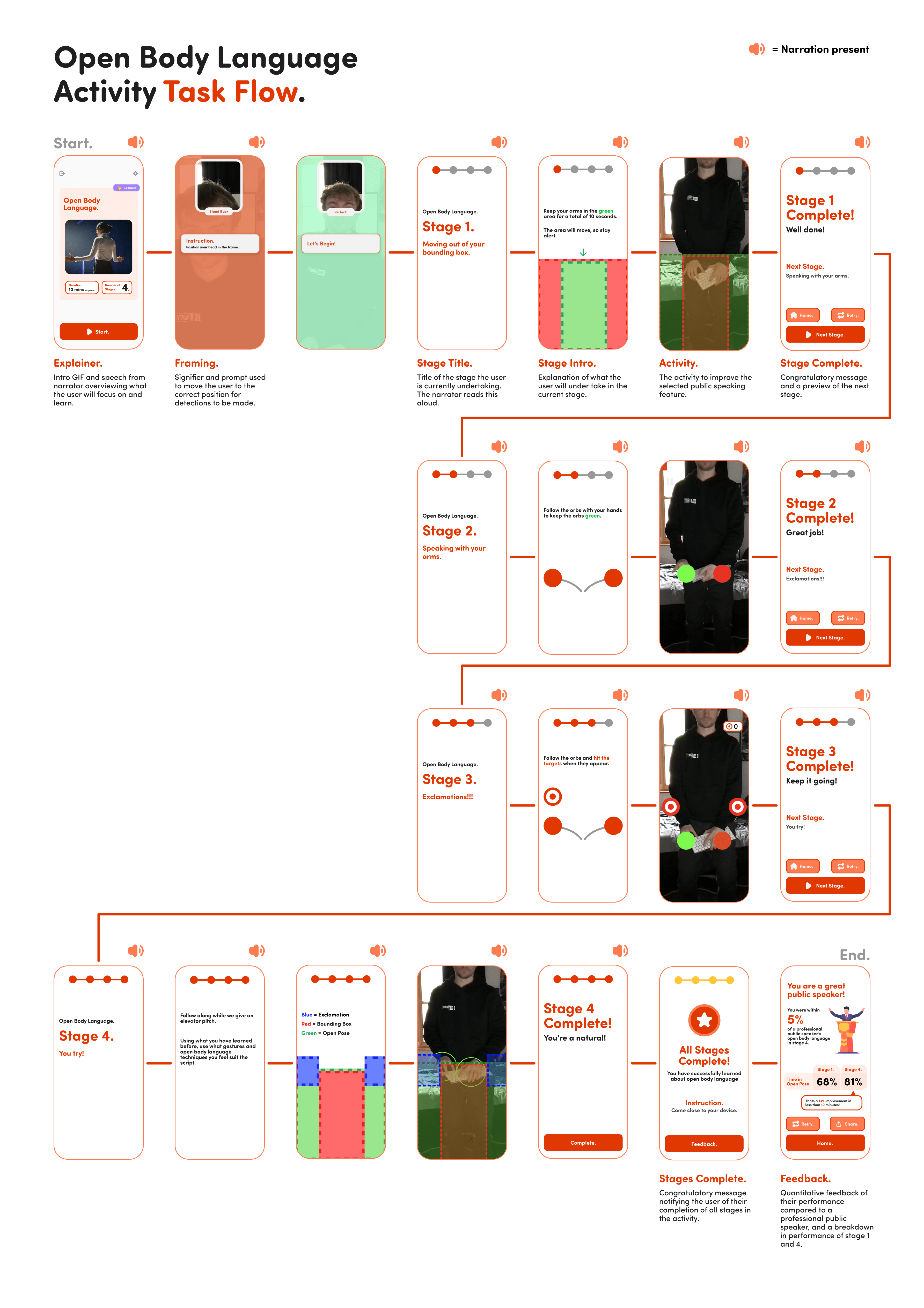
Users are brought through an arm-movement improvement activity flow. This starts as an introductory video for the first activity (“Bounding Box.”), explaining its importance. This then results in a short questionnaire about the content of the video, to promote reflection of learnings. The user can then do the activity, with a narrator speaking to them giving encouragement, information and feedback as they go through each activity.


Custom Journey Flow.
This prototype afforded users the ability to create their own improvement journey, so they can focus on their specific needs, not just general improvement. A question flow gathers information about the user’s current situation, and wants, then provides a custom journey for them based on their answers. This feature was a frequent request from users in testing.


UI Changes.
Ball Control.
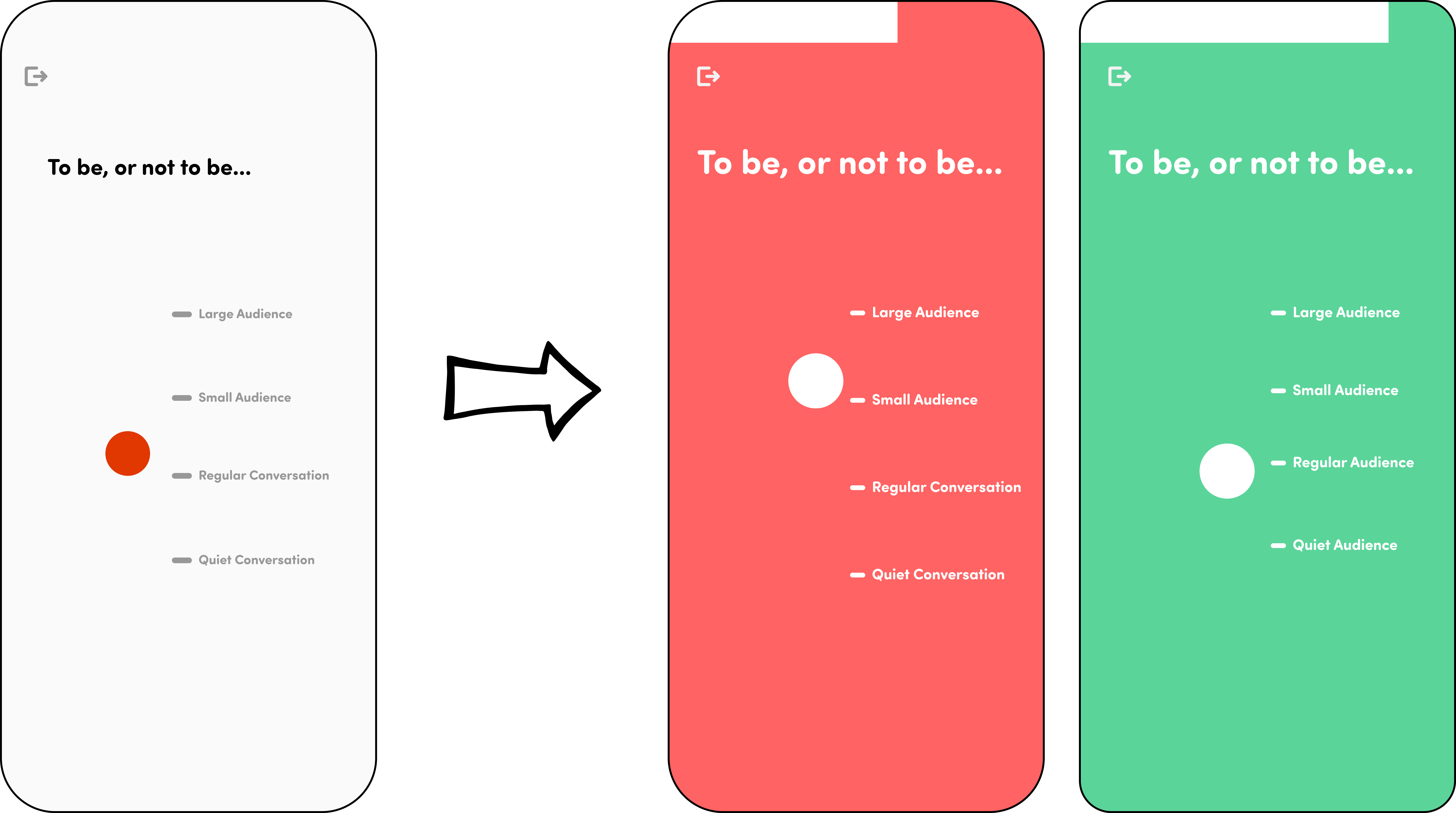
Ball control, the vocal projection activity iterated upon since the first interactive prototype, received changes in text size, making it larger for users to see. The background colour of this activity now changes depending if the user has the right or wrong level of vocal projection. This change allows users to focus on the text being displayed rather than having to glance at the level of the ball. The user is more aware of their positioning and progression.
Arm Movement Activities.
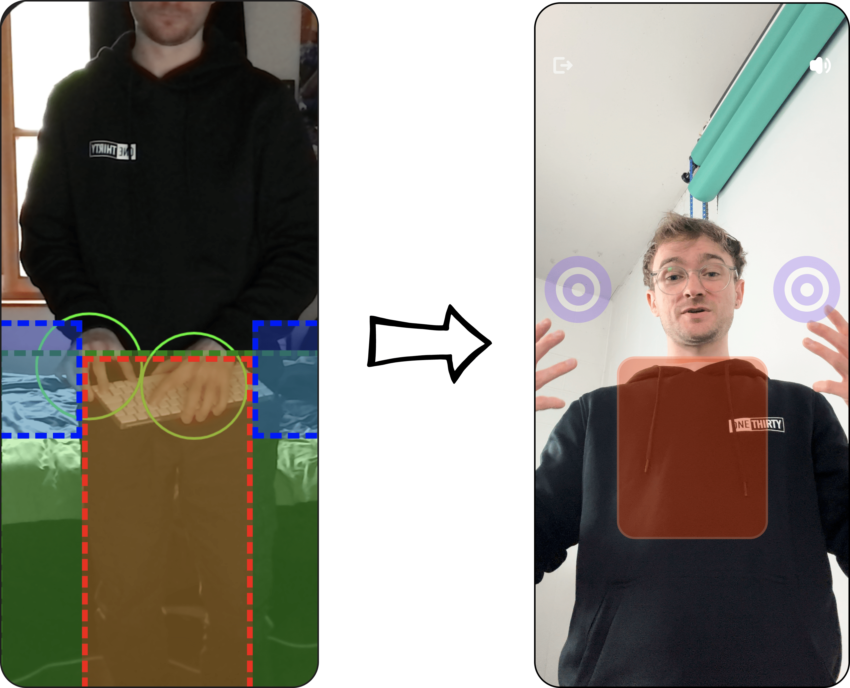
All of the arm movement activities received UI changes in the form of colour alterations to be consistent with the UI colour coding throughout the application. Visual assets such as the bounding box area and the targets for exclamations were changed to be consistent between activities, appealing to the recognition over recall design heuristic.
Accessibility.
Recite’s code adheres to the WCAG 2.0 (AA) standard. Also, Recite implements ARIA roles and labels for tags throughout its code. The UI has an ‘AAA’ contrast rating on all elements except for stylistic text, which is not necessary for any form of progression.
Multiple accessibility standards and considerations are to be amended in future, such as the ability to skip activity sessions for users who are unable to complete it due to disability.
Evaluation.
Focus Groups.
Focus groups were used to identify any problems or confusion around the activity flows. From these groups, we were able to identify what users generally liked and disliked about the application, and were able to define what could be redesigned in future.
Moderated Usability Studies.
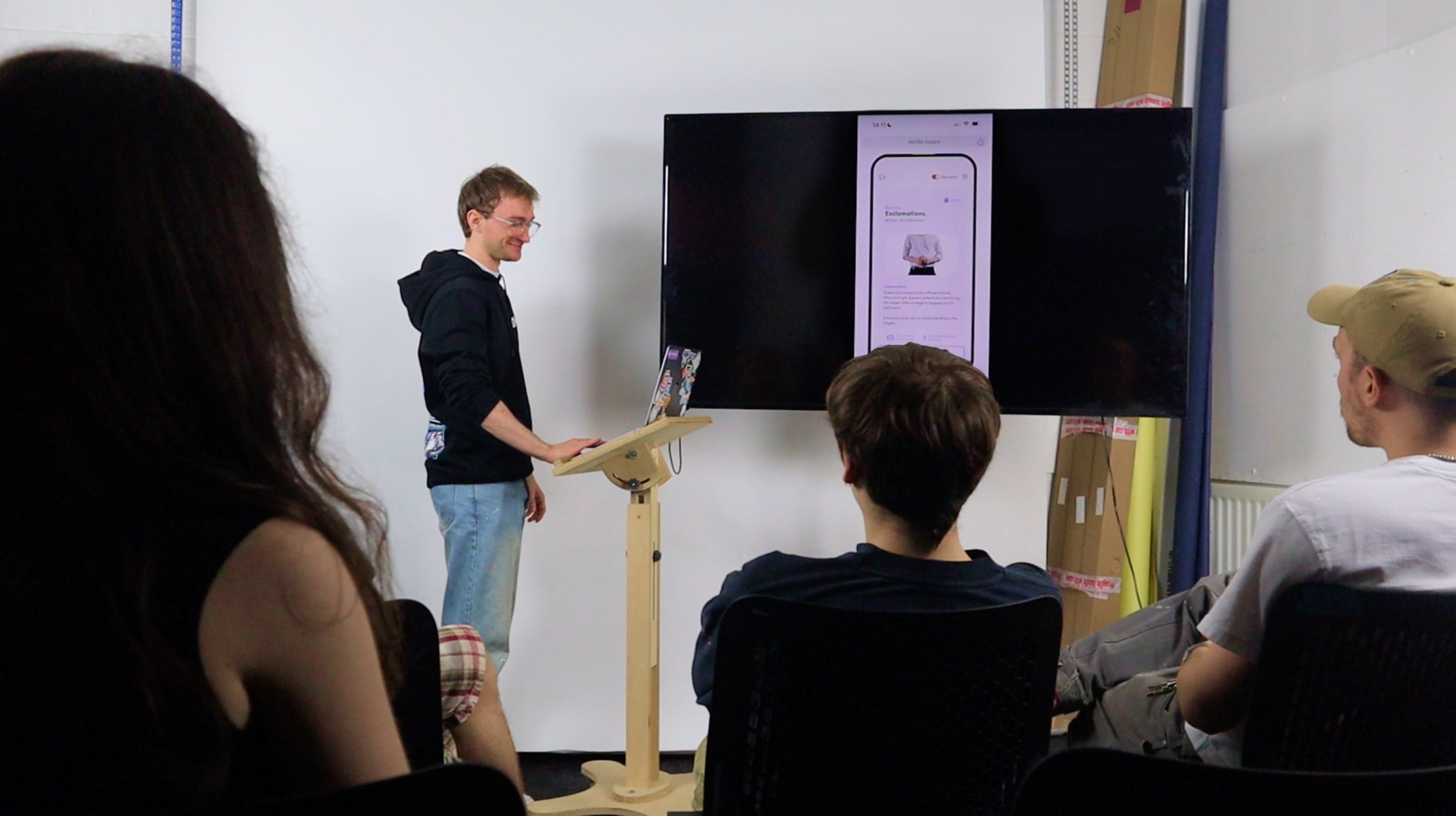
These tests were used to observe interactions users had with both the activity journey and behaviours around making a custom activity journey.
Observations.
The goal of Recite was to improve the public speaking self-confidence of young developing professionals by being enjoyable and interactive. Throughout the design and development process, young, developing professionals requested to use the product and can be seen smiling and engaging with the activities in Recite. This was both when unobserved and observed by multiple people. These observations show that with a change in perception of public speaking, young, developing professionals can find public speaking non-intimidating and can enjoy themselves whilst practising it.
